Software Designt
Software framework#
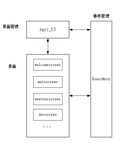
Software Design Diagram#
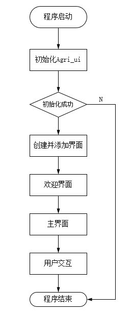
Business system startup process#
Code Explanation#
Event management#
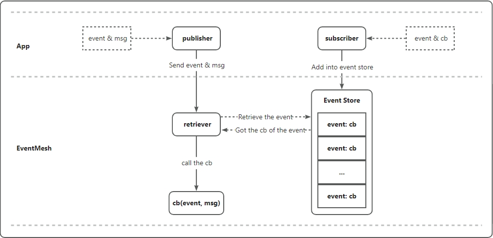
Collaboration between various modules is achieved through the EventMet event management class EventMeth event management class provides publishing and subscribing of events, as well as synchronous and asynchronous sending of messages. The framework is shown in the figure:
The definition of event management class is as follows:
- EventMesh is an application framework based on subscription and publish mechanisms, where users can subscribe to any topic of interest, which represents an event.
- At the same time as subscribing to the topic, it is also necessary to register a callback (event_cb) function to handle the generated events.
- Users can post the event anywhere it occurs and carry the message content. At this point, the callback function registered by the subscriber will be called and the event will be processed.
Principle of screen switching implementation#
In every screen interface script code generated by a touch event with a control, theadd_event_cb()method of the control is called to register a callback function for the corresponding event. The interface switching implementation is relatively simple. When the lvgl thread detects a touch event, it will issue the required operation to EventMeth through the callback function corresponding to the control.
example:
Taking the switching weather screen in the above example code as an example:
Bind callback function __weather_btn_event_cb() for weather control
ExecuteEventMesh.publish("load_screen", "WeatherScreen") in the callback function, and publish theload_streen event to EventMeth, meaning to load the screen, carrying the message WeatherScreen, indicating to load the WeatherScreen interface.
Screen module#
screen.py defines a Screen class as the base class for all interfaces, which is defined as follows:
The Screen class provides common methods required for all screen objects, such as creating screens and displaying status bar information (operator name, signal strength, system time, battery level, etc.). QuecPython uses NXP's GUI Guider as a graphical interface design tool, generates the style code for this section.
All script files ending with _screen. py implement a class inherited from class Screen(), which is the code implementation corresponding to the screen that needs to be displayed. The main content of the interface code is provided by the GUI Guider tool is automatically generated and then slightly modified, mainly by modifying the object initialization method __init__() and the control event handling callback function __xxx_event_cb().
GUI startup#
The load_screen event is subscribed to in the start() method of the class AgriUi (object) class in the Agri_ui.py script file.
example:
Thestart() method in the above code is used to launch the graphical interface of the smart agriculture control panel, and its workflow is as follows:
Call the
__create()method to create metadata for each screen interface.Call the
EventMesh. subscribe()method to subscribe to an event namedload_screen. When the event occurs, call the__route()method to process it.The
route()method matches the corresponding interface object based on the message carried when publishing the event, that is, the name of the screen interface, and calls lvgl'slv. scr_load()method to load the new interface.
Observant readers will notice that in every class implemented in the screen interface script file, there will be statements similar toself. name=" MainScreen"in its object initialization method__init__(). This statement records the name of the screen interface.The
EventMesh.publish("load_screen", "WelcomeScreen")statement is used to trigger the first interface display, which is the welcome interface. Then wait for the welcome interface to display for 2 seconds, creating a good visual experience.After the welcome interface ends, use the
EventMesh.publish("load_screen", "MainScreen")statement to trigger the display of the main interface.
At this point, the graphical interface of the smart agriculture control panel has been launched, and the subsequent interface switching is controlled by the user's touch.
In summaryAgri_ui.py performs all initialization work for the smart agriculture control panel, including lvgl initialization and MIPI LCD initialization; At the same time, it provides a graphical interface for adding screen objects and a GUI launcher. The screen object adder is used to add all possible screen objects that may need to be displayed in the application, and the GUI launcher is used to launch graphical interface functionality.
Graphic interface design#
As mentioned earlier, QuecPython uses NXP's GUI Guider as a graphical interface design tool, GUIDER not only enables interface layout design, but also automatically generates QuecPython code. Click here to view the tutorial on using the GUI Guider tool.
Layout and background settings#
Create a smart agriculture project and choose a suitable layout template and background design. This stage will start with a blank layout design, selecting a blank template and setting the resolution to 854 * 480.
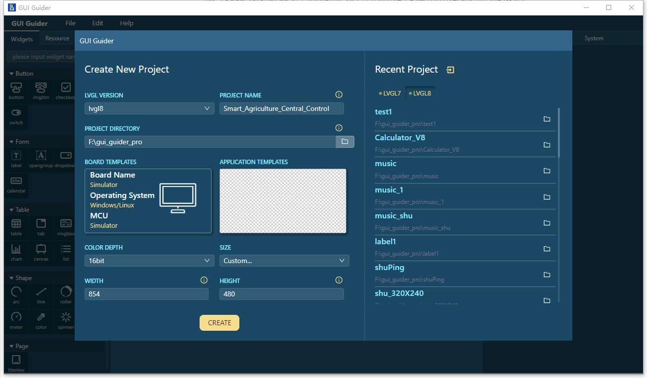
Draw screen#
This section will start drawing the various modules in the homepage.
1.Left navigation bar:
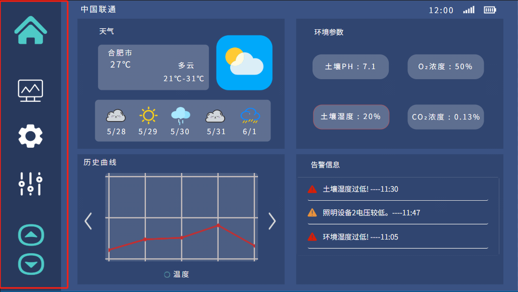
- component: imgbtn。
- icon: Use easily recognizable icons as shortcuts to access homepage, display data, settings, controls, and other functions.
- layout: The icon is vertically aligned and placed on the left side of the interface for easy use.
- interactivity: Add a selection effect to the icon to enhance the interactive experience.
When using the imgbtn component in GUI Guider software to create the left shortcut bar in the graphical interface of smart agriculture, you will need to pay attention to several key design elements:
- Icon selection:
- Each
imgbtnshould select an intuitive icon representing its function, such as a home shaped icon representing the homepage and a gear shaped icon representing the settings. - Icon design should be concise and clear, so that users can recognize its function at a glance.
- Size and spacing:
- The size of each
imgbtnshould be large enough for users to easily click, especially on touchscreen devices. - There should be appropriate spacing between shortcut keys to prevent accidental touches and make the interface look neater.
- Icon status:
- Design icons in different states, such as default state, floating state, and click state, to provide visual feedback and enhance user interaction experience.
- The 'imgbtn' component should support state switching so that users can see the interface response caused by their cross cloud actions.
- Functionality:
- Each
imgbtnshould be configured with the correct event handler to ensure that the user can trigger the correct action or navigate to the corresponding interface when clicking. - If the function represented by
imgbtnis currently activated or located on the current page, it should be displayed in different visual styles to indicate its activity status.
2.Top Information Display Bar:
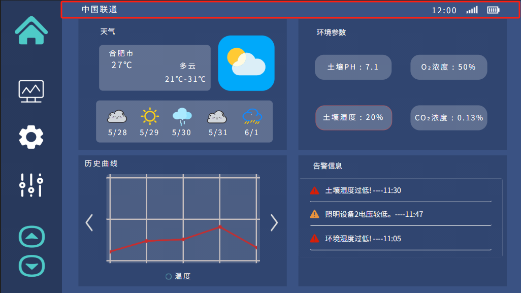
- component: label、image.
- Operator information: Display the mobile operator or network status on the top left side of the interface.
- Time display: Display the current time in the middle position at the top of the interface.
- Signal strength and battery level indication: Display icons for Wi Fi or network signal strength and current battery level on the top right side of the interface.
When using GUI Guider software to design the top information display bar of the smart agriculture control panel, combine the label and image components to create an informative and visually recognizable status bar. Here are the detailed steps on how to use these components to design the top information display bar:
- Operator information:
- Use the
labelcomponent to display operator information. Choose clear and easy to read fonts and sizes to ensure easy reading on different devices. - Place the
labelcomponent on the left side of the top information bar and set an appropriate alignment, usually left aligned.
- Use the
- Time display:
- Another
labelcomponent is used to display time. You can set a timer to ensure that the time is always updated. - The time label is usually located on the right side of the information bar and should have sufficient recognition, which can be achieved by increasing the font size and bolding.
- Another
- Signal strength:
- Signal strength can be represented by a series of predefined signal icons. These icons can display different images based on the strength of the signal.
- Use the
imagecomponent to place the signal strength icon and place it on the right side of the top information bar.
- Battery Indicator:
- The battery level indicator is also displayed using the
imagecomponent, and you can prepare a set of battery level icons to reflect different battery levels. - Place the battery icon on the far right side of the top information bar, adjacent to the signal strength icon.
- The battery level indicator is also displayed using the
3.Weather module:
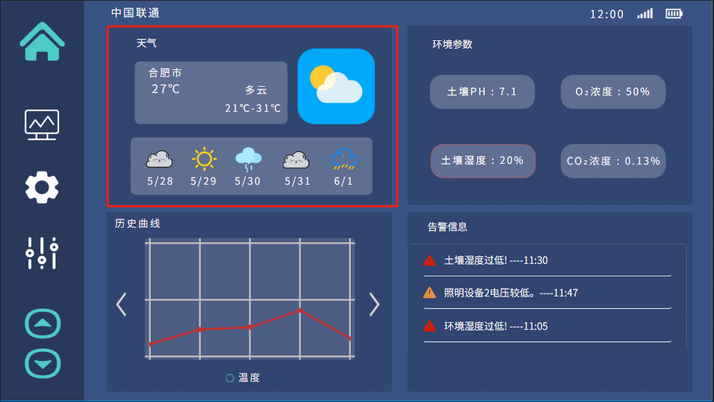
- component: label、container、image。
- Current Weather: Display the current weather conditions and temperature.
- Future weather forecast: Provide horizontal scrolling or small grids next to or below the current weather to display the weather forecast for the next few days.
When designing the weather information module on the upper left side in GUI Guider, you can combine
label,imageandcontainercomponents to create an intuitive and informative weather display area. Here are the steps on how to use these components to design a weather information module:Basic container settings:
Place a
containercomponent in the upper left corner of the interface as the basis for the weather module. This container will contain all weather related subcomponents.Adjust the size of the
containerto ensure it can accommodate all sub components without appearing crowded.
Position display:
- Use a
labelcomponent to display the current geographic location or farm name at the top of the container. - This label can use larger fonts and bold effects so that users can clearly identify location information.
- Use a
Current temperature and weather:
- Use two
labelcomponents to describe the current temperature and weather. These should use clear and easy to read fonts, and be appropriately sized for clarity at a glance. - The label for the current temperature should be the most prominent and may require larger font size and prominent colors.
- Use two
Weather icon:
- Use the
imagecomponent to display icons of current weather conditions, such as sunny, cloudy, rainy, etc. - The weather icon should be adjacent to the
labelof the current temperature, providing a visual representation of the weather.
- Use the
Weather forecast:
- Use multiple label and image components below or next to the container to display the weather forecast for the next 5 days.
- The daily forecast can be displayed using a small
imagecomponent to show the weather icon, followed by alabelcomponent to show the date.
Adaptive Design
- When designing, it is important to ensure that the weather information area can adapt to different screen sizes and resolutions, especially on responsive interfaces.
- The sub component should be able to automatically adjust its size and position when the size of the container changes.
4.Historical curve of temperature and humidity:
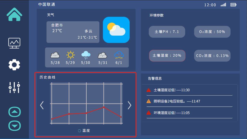
- component: container,chart ,label。
- Chart Style: Use a line graph to display historical data trends of temperature and humidity.
- Timing: Provide options to view data from different time periods, such as day, week, and month.
- Interactivity : Allow users to hover or click on points on the chart to view specific data points.
When using GUI Guider to design the temperature history curve on the lower left side of the smart agriculture graphical interface, layout the label` Chart and container components. These components will collectively form a chart area displaying temperature trends. The following are specific design instructions:
- Container Layout:
- Place a
containercomponent on the lower left side of the interface to serve as the background and framework for the temperature history curve. This container will contain charts and related labels. - Set the width and height of the container to meet the display requirements of the curve graph, while maintaining coordination with other interface elements.
- Place a
- Curve chart:
- Add a
chartcomponent inside thecontainerto draw a historical temperature data curve. - Configure the
chartcomponent to display temperature data of time series, such as setting the x-axis as the time axis and the y-axis as the temperature values, to ensure that the data points are clear and visible. - Define curve styles, such as curve color, thickness, and whether to display markers for data points.
- Add a
- Title tag
- Use the
labelcomponent above the graph or at the top of the container to display the title, such as Historical Curve. - Choose the appropriate font size and style to ensure that the title is clear and consistent with the overall design style.
- Use the
- Responsive design
- For responsive interfaces, ensure that the
containerand itschartandlabelcomponents can be appropriately scaled according to different screen sizes. - Test the display effect of charts on different resolutions and devices to ensure that the data is always clear and visible.
- For responsive interfaces, ensure that the
5.Common environmental parameters display:
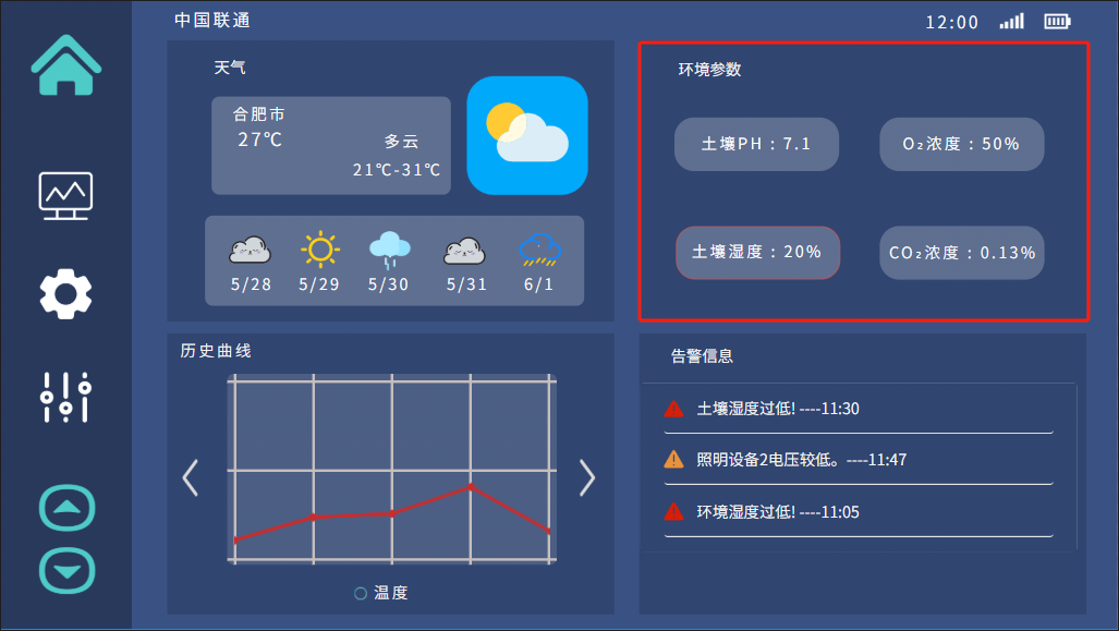
- component: container,label。
- Data display block: Display key parameters in the form of independent "blocks" or "cards", such as current readings of soil pH, soil temperature, oxygen and carbon dioxide concentrations, etc.
When designing the environmental parameter display on the upper right side of the smart agriculture graphical interface in GUI Guider software, the 'label' and 'container' components can be used to clearly display key information such as soil pH value, oxygen concentration, soil moisture, and carbon dioxide concentration. The following are detailed design steps:
- Environment parameter container:
- Place a
containercomponent on the upper right side of the interface as a wrapping element for all environment parameters. This container will help organize and separate different parameter displays.
- Place a
- Parameter label:
- For each environmental parameter, use a separate
labelcomponent to display the parameter name and value. For example, one label displays "Soil pH value: 7.1", another label displays "Oxygen concentration: 50%", and so on. - The
labelof parameter names can use smaller fonts, while thelabelof numerical values can use larger or bolded fonts to highlight numerical information.
- For each environmental parameter, use a separate
- Parameter update mechanism:
- If possible, design a data update mechanism to periodically refresh the displayed environmental parameter values. This can be done by binding the 'label' component to the data source and setting a timer to update the values.
6.Alarm Information Area:
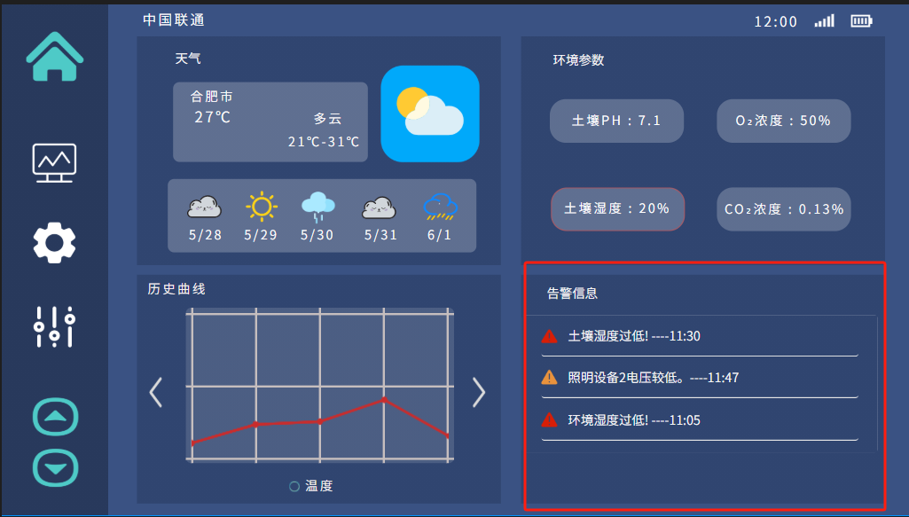
- component: container,label,table。
- list view: Display recent alerts and warnings in the form of a list or log.
- priority indication: Use color coding or icons to indicate the priority or severity of alarms.
- interactivity : Allow users to click on the alarm to obtain more details or confirm and clear notifications.
When using GUI Guider software to design the lower right alarm information area of the smart agriculture graphical interface, you can use label container and table components are used to effectively display alarm titles and specific alarm information. This area will provide users with critical security and system status updates. The following is a detailed design process:
- Alarm information container:
- Place a
containercomponent on the bottom right side of the interface as the main framework for the alarm information area. This container will contain the title and specific content of the alarm information. - Set the size of the container to ensure sufficient space to display alarm information while maintaining coordination with other elements on the interface.
- Place a
- Alarm Information Title:
- Use a
labelcomponent to display a title at the top of the container, such as Alarm Information. - Choose eye-catching and easy to read fonts and sizes to ensure that users can clearly identify the functionality of this area.
- Use a
- Alarm Information Table:
- Use the
tablecomponent below thecontainerto list specific alarm information. This can include columns such as alarm time, type, status, etc. - Adjust the column width and row height of the
tableto ensure that all information is clearly visible.
- Use the
- Alarm information style:
- Set appropriate background, border, and font colors for the
tablecomponent to maintain consistency with the overall interface style. - Consider using different colors or icons to represent different levels of alerts, such as red for emergency alerts and yellow for warnings.
- Set appropriate background, border, and font colors for the
- Alarm information update mechanism:
- Design a data update mechanism that allows the
tablecomponent to dynamically display the latest alarm information. This may require binding thetablecomponent to the backend data source and setting a scheduled refresh.
- Design a data update mechanism that allows the
- Responsive design:
- Ensure that the
containerand itstableandlabelcomponents can be appropriately scaled at different screen sizes and resolutions. - On a small screen, it may be necessary to adjust the layout of the
tableto ensure the readability of information.
- Ensure that the
When placing these elements in the GUI Guider, ensure that each component is placed according to a grid or flexible layout system to accommodate different screen sizes and resolutions. The interface design should be concise, with sufficient blank space to avoid crowding. The color scheme used should highlight important information but not be glaring. Interactive elements should provide instant feedback, such as floating or changing appearance when clicked. In addition, the design should be tested on different devices to ensure its availability and performance.
If the system is to be used under various lighting conditions, such as direct sunlight, it should be able to adjust contrast and brightness to enhance visibility. Finally, interface design should be intuitive, allowing new users to navigate without extensive training, reflecting good user experience (UX) design principles.