
LVGL - Widgets
LVGL library provides a series of widgets for building basic elements of the user interface. These widgets include but are not limited to buttons, labels, text boxes, lists, sliders and charts. Each widget has unique functionality and style, and you can customize their appearance and behavior by setting properties and styles to meet the specific requirements of application scenarios.
The following introduces the commonly used widgets in LVGL. Using these widgets can fulfill the majority of interface requirements. If you want to learn about all the widgets and their API documentation, you can visit LVGL Documentation for more information.
LVGL Base Object
Overview
The Base Object implements the basic properties of widgets on the screen, such as:
Coordinates
Parent object
Children based on the parent object
Contains the styles
Attributes like Clickable, Scrollable, etc.
The Base Object is the base class from which all other objects in LVGL are inherited.
The Base Object can be used directly as a simple widget: it is a rectangle. When no parent object is specified, a base object alone constitutes an LVGL interface. When a parent object is specified, it becomes a container.
Coordinates
Size
The object size can be modified on individual axes with set_width(new_width) and set_height(new_height), or both axes can be modified at the same time with set_size(new_width, new_height).
Position
You can set the position relative to the parent with set_x(new_x) and set_y(new_y), or both axes at the same time with set_pos(new_x, new_y).
Alignment
You can use the align property to set the alignment of a control relative to its parent container. Quecpython provides the following two methods:
obj.align(lvgl.ALIGN.type,x,y)obj.set_align(lvgl.ALIGN.type)
If you want to set it to center, use a shortcut method
obj.center().
LVGL supports the following alignment types:
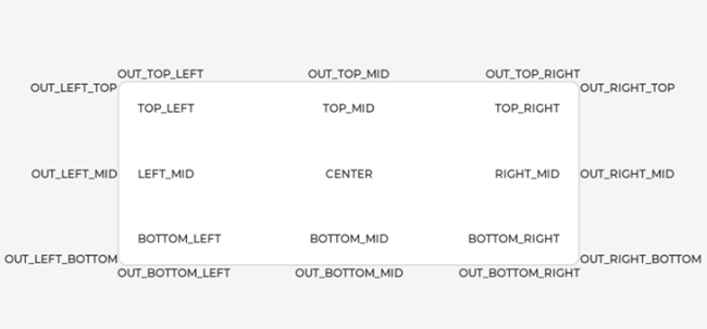
For example, the following code will shift the object by 10;20 px from the center of its parent:
import lvgl as lv

obj = lv.obj(lv.scr_act())

obj.set_align(lv.ALIGN.CENTER);
obj.set_pos(10, 20);

//Or in one function
obj.align(lv.ALIGN.CENTER, 10, 20);
Parents and Children
Except for interface objects, all LVGL widget objects have a parent object.
Parent objects and child objects have the following characteristics:
- They move together.
- Child objects are only visible within the range of the parent object.
When a widget object is created, the parent object needs to be specified. You can set a new parent for an object with obj.set_parent(new_parent). To get the current parent, use obj.get_parent().
To get a specific child of a parent, use obj.get_child(idx). Here are some examples of idx:
0: Get the first child object created.1: Get the second child object created.-1: Get the last child object created.
The children of a parent can be iterated as follows:
for i in range(obj.get_child_cnt()):
    child_obj = obj.get_child(i)
obj.get_index() returns the index of the object in its parent object.
You can bring an object to the foreground or send it to the background with obj.move_foreground() and obj.move_background().
Display and Screens
At the highest level of the LVGL object hierarchy is the display which represents the driver for a display device (physical display or simulator). Association of LVGL and Display Device has been described in the previous chapters and will not be repeated here. A display can have one or more interfaces associated with it. Each interface contains an object hierarchy of graphical widgets.
When you have created a screen like screen = lv.obj(), you can activate it with lv.scr_load(screen).
The lv.scr_act() function returns the currently active screen.
Events
To set an event callback for an object, use obj.add_event_cb(event_cb, lv.EVENT.type, user_data).
To manually send an event to an object, use lv.event_send(obj, lv.EVENT.type, param).
Please read Event overview for more details.
Styles
You can use obj.add_style(new_style, selector) to add a new style to an object.
Selector is an ORed combination of part and state(s). For example, lv.PART.SCROLLBAR | lv.STATE.PRESSED.
The base objects use lv.PART.MAIN style properties and lv.PART.SCROLLBAR with the typical background style properties.
Please read Styles overview for more details.
Flags
There are some attributes that can be enabled/disabled by obj.add/clear_flag(lv.obj.FLAG.type). lv.obj.FLAG.type can be found in the API constants.
API
Note: This section only introduces some common APIs. For all APIs, please visit the LVGL official website.
The following descriptions assume
import lvgl as lv.
Constructor
lv.obj(parent)
Create a base object (rectangle).
Parameter
parent- Object type. Parent object. If this parameter is not specified, a screen will be created.
Methods
obj.add_style(style_obj,selector)
Add a style to an object.
Parameter
style_obj- Style_obj type. Style object. The style to be added.selector- Constant type. Selector, an OR-ed value of parts and state to which the style should be added. can be combined. The main part in the pressed state and the scrollbar part in the default state can be used together. For example,lv.PART.SCROLLBAR | lv.STATE.PRESSED.
obj.add_flag(type)
Set one or more flags
Parameter
type- Constant type. The type of flag to be added.
obj.clear_flag(type)
Clear one or more flags
Parameter- Constant type. The type of flag to be cleared.
obj.add_state(state)
Add one or more states to the object. The other state bits will remain unchanged. If specified in the styles, transition animation will be started from the previous state to the current.
Parameter
state- Constant type. The state to be added.
obj.clear_state(state)
Clear one or more states of the object. The other state bits will remain unchanged. If specified in the styles, transition animation will be started from the previous state to the current.
Parameter
state- Constant type. The state to be cleared.
obj.get_state()
Get the state of an object.
Constants
flag
Macro switch
lv.obj.FLAG.HIDDENMake the object hidden.lv.obj.FLAG.CLICKABLEMake the object clickable by the input deviceslv.obj.FLAG.CLICK_FOCUSABLEAdd a focused state to the object when clickedlv.obj.FLAG.CHECKABLEToggle checked state when the object is clickedlv.obj.FLAG.SCROLLABLEMake the object scrollablelv.obj.FLAG.SCROLL_ELASTICAllow scrolling inside but with a slower speedlv.obj.FLAG.SCROLL_MOMENTUMMake the object scroll further when "thrown"lv.obj.FLAG.SCROLL_ONEAllow scrolling only one snappable childlv.obj.FLAG.SCROLL_CHAINAllow propagating the scroll to a parentlv.obj.FLAG.SCROLL_ON_FOCUSAutomatically scroll the object to make it visible when focusedlv.obj.FLAG.SNAPPABLEIf scroll snap is enabled on the parent it can snap to this objectlv.obj.FLAG.PRESS_LOCKKeep the object pressed even if the press slid from the objectlv.obj.FLAG.EVENT_BUBBLEPropagate the events to the parent toolv.obj.FLAG.GESTURE_BUBBLEPropagate the gestures to the parentlv.obj.FLAG.ADV_HITTESTAllow performing a more accurate hit (click) test. E.g. consider rounded corners.lv.obj.FLAG.IGNORE_LAYOUTMake the object position-able by the layoutslv.obj.FLAG.FLOATINGDo not scroll the object when the parent scrolls and ignore the layout
PART
lv.PART.MAINA background like rectanglelv.PART.SCROLLBARThe scrollbar(s)lv.PART.INDICATORIndicator, e.g. for slider, bar, switch, or the tick box of the checkboxlv.PART.KNOBLike handle to grab to adjust the valuelv.PART.SELECTEDIndicate the currently selected option or sectionlv.PART.ITEMSUsed if the widget has multiple similar elements (e.g. table cells)lv.PART.TICKSTicks on a scale, e.g. for charts or gaugeslv.PART.CURSORMark a specific place e.g. for text area's cursor or on a chartlv.PART.CUSTOM_FIRSTExtension point for custom widgets
state
lv.STATE.DEFAULTNormal, released state, default statelv.STATE.CHECKEDToggle or selected statelv.STATE.FOCUSEDFocused via keypad or encoder or clicked via touchpad/mouselv.STATE.FOCUS_KEYFocused via keypad or encoder but not via touchpad/mouselv.STATE.EDITEDEdited by an encoderlv.STATE.HOVEREDHovered by mouse (not supported now)lv.STATE.PRESSEDBeing pressedlv.STATE.SCROLLEDBeing scrolledlv.STATE.DISABLEDDisabled
flex-flow
lv.FLEX_FLOW.ROWPlace the children in a row without wrappinglv.FLEX_FLOW.COLUMNPlace the children in a column without wrappinglv.FLEX_FLOW.ROW_WRAPPlace the children in a row with wrappinglv.FLEX_FLOW.COLUMN_WRAPPlace the children in a column with wrappinglv.FLEX_FLOW.ROW_REVERSEPlace the children in a row without wrapping but in reversed orderlv.FLEX_FLOW.COLUMN_REVERSEPlace the children in a column without wrapping but in reversed orderlv.FLEX_FLOW.ROW_WRAP_REVERSEPlace the children in a row with wrapping but in reversed orderlv.FLEX_FLOW.COLUMN_WRAP_REVERSEPlace the children in a column with wrapping but in reversed order
Label
Overview
A label is the basic object type that is used to display text.
Parts and Styles
lv.PART.MAINUses all the typical background properties and the text properties. The padding values can be used to add space between the text and the background.lv.PART.SCROLLBARThe scrollbar that is shown when the text is larger than the widget's size.lv.PART.SELECTEDTells the style of the selected text. Onlytext_colorandbg_colorstyle properties can be used.
Usage
Set Text
ou can set the text on a label at runtime with label.set_text("New text").
Newline characters are handled automatically by the label object. You can use \n to make a line break. For example: "line1\nline2\n\nline4".
Long Mode
By default, the size of the label is automatically expanded to the text size. If the width or height is explicitly set (using label.set_size, for example, or through layout), the lines wider than the label's width can be manipulated according to several long mode policies. Similarly, the policies can be applied if the height of the text is greater than the height of the label.
lv.label.LONG.WRAPThe text is too long and will be clipped. (Default)lv.label.LONG.DOTReplaces the last 3 characters from the bottom right corner of the label with dots (.)lv.label.LONG.SCROLLIf the text is wider than the label scroll it horizontally back and forth. If it's higher, scroll vertically. Only one direction is scrolled and horizontal scrolling has higher precedence.lv.label.LONG.SCROLL_CIRCULARIf the text is wider than the label scroll it horizontally continuously. If it's higher, scroll vertically. Only one direction is scrolled and horizontal scrolling has higher precedence.lv.label.LONG.CLIPClip the parts of the text outside the label.
You can specify the long mode with label.set_long_mode(type).
Events
No special events are sent by the Label. You can use lv.obj.FLAG.CLICKABLE to make a label clickable, so that it behaves like a transparent button and can have click events attached to it.
API
Note: This section only covers some common APIs. For a complete list of APIs, please refer to the LVGL documentation.
Constructor
lv.label(parent)
Create a label.
Parameter
parent- Object type. Parent object of the new label. Required.
Method
label.set_text(text)
Set a new text for a label.
Parameter
text- String type. The text to be displayed.
label.set_long_mode(type)
Set the long text mode for the label.
Parameter
type- Constant type. The long text mode.
label.get_text()
Get the text of a label.
Return Value
text- String type. The text of the label
Constants
LONG
Long text modes.
lv.label.LONG.WRAPThe text is too long and will be clipped. (Default)lv.label.LONG.DOTReplaces the last 3 characters from bottom right corner of the label with dots (.)lv.label.LONG.SCROLLIf the text is wider than the label scroll it horizontally back and forth. If it's higher, scroll vertically. Only one direction is scrolled and horizontal scrolling has higher precedence.lv.label.LONG.SCROLL_CIRCULARIf the text is wider than the label scroll it horizontally continuously. If it's higher, scroll vertically. Only one direction is scrolled and horizontal scrolling has higher precedence.lv.label.LONG.CLIPClip the parts of the text outside the label.
Image
Overview
Images are the basic object to display images from flash (as arrays) or from files. Images can display symbols (LV_SYMBOL_...) too.
Parts and Styles
lv.PART.MAIN- A background rectangle that uses the typical background style properties and the image itself using the image style properties.
Usage
Image Source
To provide maximum flexibility, the source of the image can be:
- A file from the file system.
- A symbol icon.
To set the source of the image, use img.set_src(src).
To use a file from the file system, download the image file to the file system and use img.set_src("U:/my_img.jpg").
You can also set symbols similar to labels. In this case, the image will be rendered as text according to the font specified in the style. It enables to use of light-weight monochrome "letters" instead of real images. You can set symbols like img.set_src(lv.SYMBOL.OK).
Transformations
Using the lv_img_set_zoom(img, factor) the images will be zoomed. Set factor to 256 or LV_IMG_ZOOM_NONE to disable zooming. A larger value enlarges the images (e.g. 512 double size), a smaller value shrinks it (e.g. 128 half size). Fractional scale works as well. E.g. 281 for 10% enlargement.
To rotate the image use lv_img_set_angle(img, angle). Angle has 0.1 degree precision, so for 45.8° set 458.
By default, the pivot point of the rotation is the center of the image. It can be changed with lv_img_set_pivot(img, pivot_x, pivot_y). 0;0 is the top left corner.
The quality of the transformation can be adjusted with lv_img_set_antialias(img, true/false). With enabled anti-aliasing the transformations are higher quality but slower.
Note that the real coordinates of image objects won't change during transformation. That is lv_obj_get_width/height/x/y() will return the original, non-zoomed coordinates.
Events
No special events are sent by image objects.
You can make the image clickable by using lv.obj.FLAG.CLICKABLE, so that it behaves like an image button and can have click events attached to it.
Note: The image can use the image cache mechanism, so it is recommended to use the image instead of the image button.
API
Note: This section only covers some common APIs. To view all APIs, please visit LVGL Documentation.
Constructor
lv.img(parent)
Create an image object.
Parameter
parent- Object type. Parent object of the new image. Required.
Methods
img.set_src(src)
Set the image data to display on the object
Parameter
src- 1) String type. Path to an image file. 2)SYMBOL(e.g.lv.SYMBOL.OK)
img.set_offset_x(x)
Set an offset for the source of an image so the image will be displayed from the new origin.
Parameter
x- Integer type. The new offset along x axis.
img.set_offset_y(y)
Set an offset for the source of an image. so the image will be displayed from the new origin.
Parameter
y- Integer type. The new offset along y axis.
img.set_angle(angle)
Set the rotation angle of the image.
Parameter
angle- Integer type. Rotation angle in degree with 0.1 degree resolution.
img.set_zoom(factor)
Set the zoom level for the image.
Parameter
factor- Integer type. Zoom level, 256 for the original size, 512 for double size.
img.set_pivot(x, y)
Set the rotation center of the image. The image will be rotated around this point.
Parameter
x- Integer type. Rotation center x of the imagey- Integer type. Rotation center y of the image
img.set_antialias(antialias)
Enable/disable anti-aliasing for the transformations (rotate, zoom) or not. The quality is better with anti-aliasing looks better but slower.
Parameter
antialias- Boolean type.True: Anti-aliased
False: Not anti-aliased
Button
Overview
Buttons have no new features compared to the base object. They are useful for semantic purposes and have slightly different default settings.
Buttons, by default, differ from base object in the following ways:
- Not scrollable
- Added to the default group
- Default height and width set to
LV_SIZE_CONTENT
Parts and Styles
lv.PART.MAIN- The background of the button.
Usage
There are no new features compared to the base object,
Events
LV_EVENT_VALUE_CHANGED when the LV_OBJ_FLAG_CHECKABLE flag is enabled and the object is clicked.
Events
Please note that the state of lv.KEY.ENTER is converted to lv.EVENT.PRESSED/PRESSING/RELEASED, etc.
Refer to the events of Basic objects.
API
Note: This section only covers some common APIs. To view all APIs, please visit LVGL Documentation.
Constructor
lv.btn(parent)
Create a button object.
Parameter
parent- Object type. Parent object of the new button. Required.
Other LVGL widgets
In addition to the widgets mentioned above, LVGL also provides the following widgets. Please choose the appropriate widget based on your needs.
| widget | Constructor | Description | LVGL Official Website Link |
|---|---|---|---|
| List | lv.list() |
The List is basically a rectangle with a vertical layout to which Buttons and Texts can be added. | Extra widgets - List |
| Window | lv.win() |
The Window is container-like object built from a header with title and buttons and a content area. | Extra widgets - Window |
| Arc | lv.acr() |
The Arc consists of a background and a foreground arc. The foreground (indicator) can be touch-adjusted. | Core widgets - Arc |
| Bar | lv.bar() |
The bar displays progress. | Core widgets - Bar |
| Switch | lv.sw() |
The Switch looks like a little slider and can be used to turn something on and off. | Core widgets - Switch |
| Tile view | lv.tileview() |
Menu page available, with finger tracking effect compared with the animation for switching between interfaces. | Extra widgets - Title view |
| Meter | lv.meter() |
The Meter widget can visualize data in very flexible ways. In can show arcs, needles, ticks lines and labels. | Extra widgets - Meter |
| Chart | lv.chart() |
Line chart, bar chart and scatter chart. | Extra widgets - Chart |
| Keyboard | lv.keyboard() |
Special button matrix that realizes a virtual keyboard to write texts into a text area. | Extra widgets - Keyboard |
| Menu | lv.menu() |
Multi-level menu that automatically handles traversal between pages. | Extra widgets - Menu |